


I have selected these 3 posters to give me inspiration towards my own poster design. Things I like would inslude and I may use in my own work would include: 1, an overall retro, strong pop art colour look. 2, I like the text being the same as the background colour. 3, processed photos showing local elements.

By using an image I took of the belfast crane, I cropped thhe image and removed the excess space

I used this image from google as inspiration for the colours I would like to use in my poster. I got inspired from the neon blue and red and this is evident in my final piece.
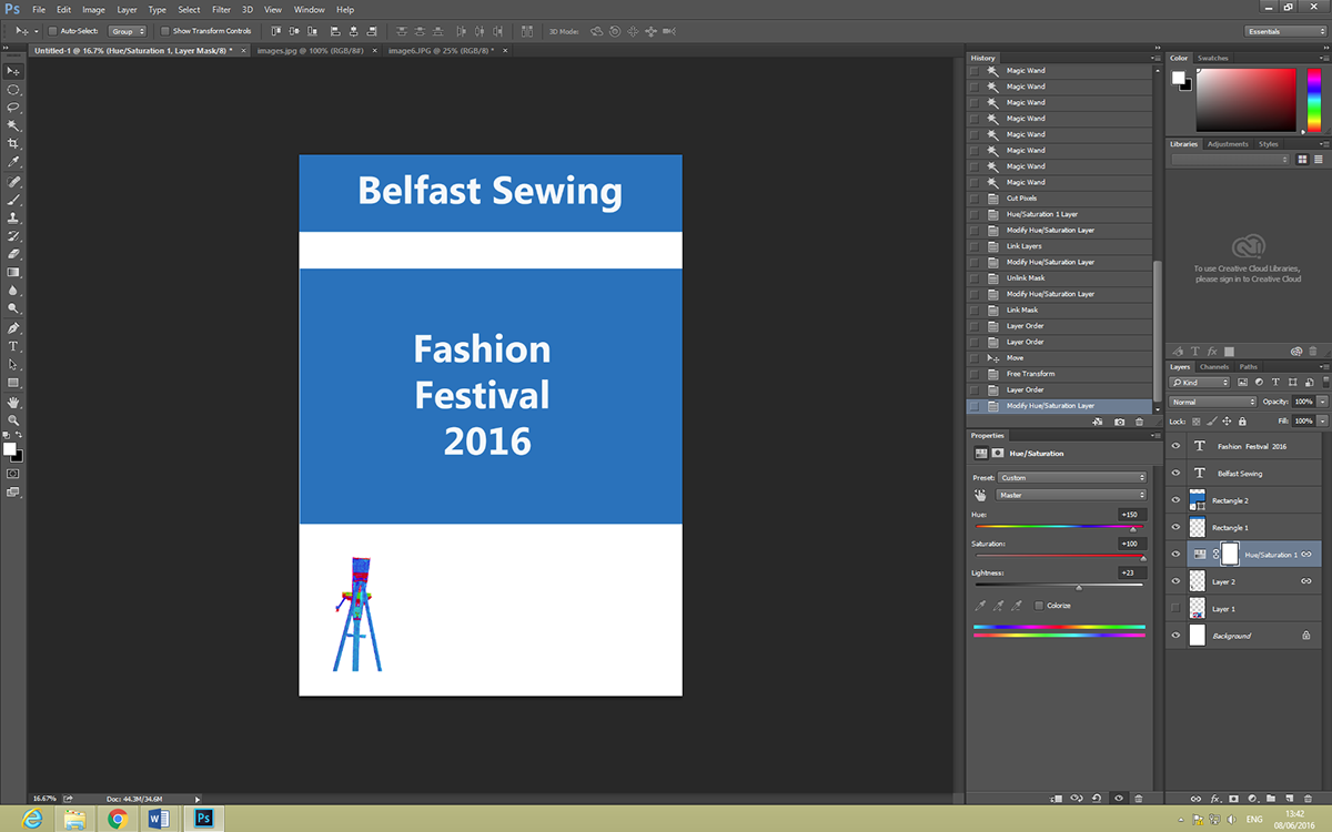
by using my colour inspiration and poster inspiration I created my own poster using block colours and a bold white font matching the background of this piece. I then used the same colour inspiration to create a saturated pop colour for the crane imagery.

I used a mind mapping technique to generate my ideas towards the theme of my task. I found this method helpful and it allowed me to narrow my theme down to my inital festival idea

This is my print out version of my final poster.
I personally like the coutcome as I like the simpliscity and how the message is delivered clearly.
from my experience in my other task I have deffinitley improved my technique within photoshop I feel I have a better understanding of the tools and how to create appropriot imagery.
However I feel that my poster needs to be alot bigger in size as A4 looks too small. Also I feel my poster may be too plain If I was to repeat this task in the future I would add more images to promote the belfast local culture as the image of 1 crane is not enough. I would also like to add more text relating to the details of the event.

